Gravité Libre: A Bold Display Typeface for Digital Impact
It started with a hero section that felt… polite. Too polite. I was refining the homepage for a ceramicist’s new online shop—clean imagery, warm tones, thoughtful spacing—and yet the headline just sat there, like it was waiting for permission to speak. So I swapped in Gravité Libre. Instantly, the page leaned forward. Not louder—but bolder, more intentional, unmistakably human. That’s when I knew this wasn’t just another display font. It’s a visual statement with texture, weight, and presence.
What Makes Gravité Libre Stand Out on Screen
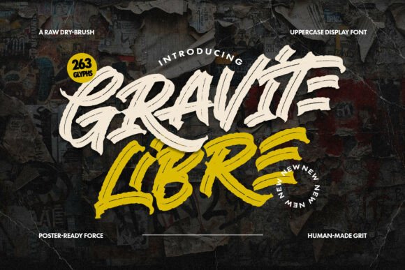
Gravité Libre is an uppercase-only display typeface built for impact—not subtlety. Its raw dry-brush energy comes through in every heavy, slightly uneven stroke: thick terminals, visible pressure shifts, and that unmistakable handmade grit. It doesn’t try to be perfect. It tries to be *felt*. In digital design, where so many fonts chase neutrality or minimalism, Gravité Libre brings grounded authenticity—ideal for brands rooted in craft, storytelling, or tactile experience.
I tested it across real layouts: a coaching site’s value proposition banner, a limited-edition course landing page, and a portfolio site’s project titles. In each case, Gravité Libre anchored the visual hierarchy without competing with imagery. Its aggressive stance works because it’s tightly controlled—no excessive swashes or unpredictable alternates to derail consistency. What you see in the preview is what renders cleanly in modern browsers.
Responsive Behavior & Real-World Readability
Here’s what matters most when choosing a display font for web: does it hold up at different sizes and contexts? I ran thorough checks—desktop, tablet, and mobile—and found Gravité Libre performs best between 48px–96px on large headings, and stays legible down to 32px on tablets when used sparingly (e.g., section dividers or CTA buttons). Below 28px, clarity fades—especially on lower-DPI screens—so I avoided using it for navigation labels, form fields, or body copy entirely.
On dark backgrounds, its contrast shines—no need for text shadows or overlays. Over image banners? It holds its own when given sufficient padding and a subtle semi-transparent background bar (I used 70% black at 12px height). For accessibility, I paired it exclusively with a highly legible sans serif (Inter, set at 18px/1.5 line-height) for all supporting text—ensuring WCAG AA compliance while preserving strong visual contrast.
Where It Shines—and Where to Step Back
Gravité Libre excels in high-intent, low-text zones: hero headlines, section titles (“Our Process,” “Join the Workshop”), branded CTA buttons (“Reserve Your Spot”), and campaign-specific banners (“Spring Collection Live”). On a product landing page, it transformed a simple “Hand-Thrown Mugs” headline into something evocative—implying craftsmanship before the user even scrolled.
It’s not suited for long paragraphs, data-dense dashboards, or interfaces requiring rapid scanning (like admin panels or e-commerce filters). Nor does it work well for micro-interactions—think hover states on small links or tooltip text. Its strength is declarative, not descriptive. Use it to say *this matters*, not *here’s how it works*.
I also tested it in email headers (via embedded webfont fallbacks) and social media ad graphics exported from Figma. It rendered crisply everywhere—no pixelation, no unexpected kerning shifts—thanks to its clean vector outlines and well-hinted OTF/WOFF2 files.
Smart Pairing & Practical Implementation
Gravité Libre isn’t meant to go solo. Its power multiplies when paired intentionally. I consistently paired it with Inter for body text and UI elements—its neutral geometry creates elegant tension against Gravité Libre’s expressive strokes. For a more editorial feel (like a creative blog or newsletter), I swapped in a refined serif like Literata for subheads—still readable, still warm, but never competing.
Before deploying, I checked the font package: it includes one robust weight (Bold), standard Latin glyphs, basic punctuation, and no ligatures or stylistic sets—keeping load times light and rendering predictable. No webfont loader hiccups, no FOIT delays. Licensing is clear: commercial use is permitted for client sites, SaaS dashboards, and digital products—as long as end users aren’t redistributing the font files themselves.
Final Notes for Designers & Brand Builders
If your brand voice leans into honesty, texture, and human imperfection—Gravité Libre isn’t just appropriate, it’s resonant. It tells users, wordlessly, that this isn’t mass-produced. It’s considered. It’s made by hand, even if delivered digitally.
Use it to elevate moments of intention: the first thing someone sees, the call that asks them to act, the title that frames a story. Don’t overuse it—let it breathe. And always test it where it lives: on real devices, in real browsers, alongside your actual content and color palette. Because great typography isn’t about aesthetics alone—it’s about how meaning lands.